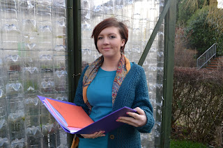
This is the final picture that I decided to use in my preliminary task. The reason I decided to use this was that Laura is based in the centre of the shot and in this picture she looks really natural with her expression. Im really happy with this shot of Laura.
Friday, 27 January 2012
Thursday, 26 January 2012
First Attempt Shots For Front Cover
I decided not to use this photo because I felt that I hadn't gone close enough to her face for it to appeal to the audience because they want to fell like Laura is interacting with them.
I also didn't use this one because i felt that Laura wasn't central enough for the front cover because most of the attention is focused on the background instead of her.
I didn't choose this photo because the folder which I find a crucial part of the photo has been cut off and I wanted one which had the folder as a whole.

On this photo I feel like Laura is forcing a smile here and I want the photo to be as natural as possible.
Wednesday, 25 January 2012
Magazine Terminology
Title/Banner/Masthead- The distinguishing name of the magazine
Sell line- The sell line is above the masthead and it advertises something.
Burst- A start shape which usually holds something special in it like a special price
Font- There are 2 types of font and these are sefif which is more formal and sans serifis more modern and upto date.
Barcode- All magazines must have a barcode
Colour scheme- The colour scheme could be black and white or they could have a 3 colour scheme. However, some magazines dont stick to this.
Monday, 23 January 2012
School Magazine Textual Analysis 2
This is the second magazine i will analyse.
In comparison to the first magazine the title of one dosn't neccasarily relate to the fact that it is a school magazine. Furthermore, compared to the first magazine cover, the colour scheme used in this one is very bland and the use of the black, white and the dark green it wouldnt jump out at a costumer on a shelf becasue the colours arent vibrant.
In comparison to the first magazine the title of one dosn't neccasarily relate to the fact that it is a school magazine. Furthermore, compared to the first magazine cover, the colour scheme used in this one is very bland and the use of the black, white and the dark green it wouldnt jump out at a costumer on a shelf becasue the colours arent vibrant.
They have used different font sizes especially for the title which is bigger than the rest of the text however, all the sub headings are the same size so none of the them really would appeal to someone walking past.
The picture and background used are good as they have used a shadow effect of 2 people at the top of the front cover, however to improve this they could have used a picture which has a brighter colour scheme as overall the picture just blends into the background.
The shot used for the picture is a mid to long shot because you can see more of the boy than the girl where you only see half of her body. The font used here is sans serif and this is modern which could illustrate the 2 young up to date models on the front cover.
Friday, 20 January 2012
School Magazine Textual Analysis 1
This is the first magazine I chose to analyse and it has many conventions which make it appealing.
Firstly, the title for this magazine cover is straight to the point and that means it is very easy for buyers to tell that it is a school magazine. Next, there are many different colours used in this front cover and the colours used are very bright and vibrant. Therefore this will appeal to a younger audience so its ideal for a school environment.
Furthermore, there are many different font sizes which help grasp the audiences attention and for example the word "Jitters" they have customised into capital letters so that it it stands out and attracts people so they find it more of a appealing magazine and front cover.
Also, the picture is really great because it covers nearly all of the page so it is of a generous size and the shot used is a mid shot of the girl because half her body is clearly viewable. Furthermore, the actress having the photo taken she has been directed to look straight into the camera therefore they wanted the photo to represent the girl engaging into the audiences eyes. This will result in more people liking and buying this magazine.
The font used in this front cover is sans serif which is quite modern and basic so to improve this front cover they could try to experiment with others.
Thursday, 19 January 2012
Welcome To My Blog!
Hi and welcome to my blog!
The premilanary task we have to do is a front cover of a school magazine and a mock up of a contents page.
The main task is to create our own music magazine and produce a front cover, contents and double page spread.
I hope you enjoy my work!
Subscribe to:
Comments (Atom)


